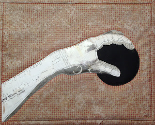
Gingham be gone
I posted my hand yesterday, but I wasn't finished yet; I didn't really care for the background fabric. Today, I spent a little time trying to muddy it up. Did I make it better or worse? Am I going in the right direction or have I made a mess? Let me know what you think.

Comments
I found the gingham to be an annoying distraction from the focus of your piece. BUT, it's darkness gave good contrast to the arm.
I like the altered background much better...it feels right to me. BUT, now there's not as much contrast.
That said, I'd have done the same thing you did. I think you made a good choice.
Maybe think about some very dense but simple quilting to flatten the background and let the arm pop up in relief? I'm thinking close straight lines on the horizontal, with occasional verticals.
Another idea, since this is veering toward steampunk, is to quilt something like one very large gear in a dark metal color in the background to echo the black ball. Maybe with the ball as the center of the gear (and, therefore, parts of the gear off the page)?
The arm is so powerful -- almost mythic -- I think the danger here would be to do too much.
Put a piece of acetate over the piece and sketch some things on the acetate to see what you think might work.
Thank you so much for your comments!
At least you're working and moving forward ("it doesn't matter how slowly you go, so long as you do not stop!")! I have to agree with everyone- I like the distressed background because it fits the hand better, but the contrast is lost - I think stitching is probably the best solution, a change in texture, even a flattening out of the background due to quilting. And I actually kind of like the graphic lines of the gingham - I think it goes with the graphics of the hand and the print on the paper. Bravo for not giving up!