Sue Reno and Surface Design Essentials
I met Sue Reno through the internet many years ago and had the good fortune to share a meal with her a few years back. She is exactly the same as her blog persona: passionate about nature and conservation: articulate, thoughtful, and intelligent; and above all else, very kind. Her art has captured my attention, and that of the mixed media art world, with its graphic designs and lovely mix of colors for quite a while. So it should be no surprise that I'm honored and thrilled to be part of Sue Reno's blog tour for her new Quilting Arts Workshop DVD, Surface Design Essentials for the Printed Quilt.
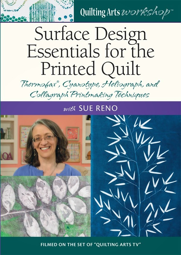
I love to add to paint to the surfaces of my quilts, but have only a few techniques in my arsenal. Sue's DVD is a perfect antidote to that problem. Following an introduction describing the appeal of adding images to fabric, Sue introduces four printing styles -- cyanotype, heliograph, Thermofax®, and collagraph -- as a separate chapter. It's easy to watch the DVD in one sitting or to select the method that most suits your interest at the time.
Sue begins each chapter with a list of the supplies necessary for the technique, and then demonstrates each step of the process. Sue is so comfortable with each one that she never falters. The only interruption to her very clear instructions are when she shares interesting tidbits about the techniques, their history, or the plants she's using to make her prints. Sue has a nice balance between assuming what knowledge we already have and explaining things we might not know, making the DVD helpful for beginning and advanced artists alike. At the end of each segment, Sue shares a few of her works that incorporate that particular technique. It's great to see the variety of ways Sue has used these printing methods while still staying true to her signature style.
I decided to try my hand at cyanotype printing partly because I think the resulting Prussian blue is so luscious, but also because it strikes close to my photographer's heart. Cyanotype printing is essentially a photographic printing technique using a substrate (in this case, fabric) that's been chemically treated, and UV light (sunlight) to create an image using resists. Though it's optimal to do cyanotype printing on warm sunny days, I only had the opportunity to experiment on a partly cloudy, blustery, 54 degree day.
There weren't many plants with fresh leaves left in my garden so I improvised a bit. I gathered a few leaves and stencils to create my images. I pinned all the items to the treated cloth and set the board in the sun, securing it with rocks I've unearthed while gardening.

In the DVD, Sue shares a few of her samples that show how the density of the foliage or flowers results in different shades within the print; for example, a thick green leaf is going to let less light through than a delicate white flower petal. With that in mind, I hoped to achieve similar results with the opaque circle stencil and the pin shadows.

In ideal conditions, the fabric should be exposed for 10 minutes. I let my fabric sit for almost 20 minutes and I could tell something worked because the color had changed just like Sue had described. See, it's much grayer now.

I brought my samples inside to stop the exposure process and removed the pins on one of the letters. I felt it wise to do a progress check. It looked like it worked despite the breeze and the cool temperatures.

I had set up my station on top of my washing machine, in easy reach of the sink. Since I don't have basins to use for rinsing out the photographic chemicals, I was using warm running water to rinse my pieces. I was pleasantly surprised to see that the circle stencil had actually left a bit of a mark.

After quick rinse (it really doesn't take long), a little bit of rubbing (the images weren't diminshed at all by my scrubbing), and a bit of giggling over the luscious Prussian blue, I set the bits to dry and then iron. Viola, here are the finished samples.

The only one that didn't leave a crisp edge was the "E", but as you can see in one of the pictures above, the top of the "E" bent back in the wind so it didn't rest closely to the cloth. Perhaps I should have pinned it down, but I now rather like how wonky it is.

I also really like the subtlety of the print left by the circle stencil and the pin shadows. I can now imagine lots of ways to use this printing technique! I'm looking forward to continuing to experiment with cyanotype printing, and trying my luck with the others Sue details as well.
I hope you'll give Sue's DVD a try. It can be purchased from Interweave as a download or a disc. To read what other artists thought about Sue's DVD, be sure to visit all the blogs on the tour:
11/5/14: Sue Reno http://suereno.blogspot.com/
11/6/14: Susan Brubaker Knapp http://wwwbluemoonriver.blogspot.com/
11/7/14: Allie Aller http://alliesinstitches.blogspot.com/
11/8/14: Diane Doran http://www.oohprettycolors.blogspot.com/
11/9/14: Vivien Zepf http://sevenpinesdesigns.blogspot.com/
11/10/14: Virginia Spiegel http://www.virginiaspiegel.com/blog/
11/11/14: Cynthia St. Charles http://cynthia-stcharles.blogspot.com/
11/12/14: Natalya Aikens http://artbynatalya.blogspot.com/
Comments